Intuition Behind Whitening Image Patches
In the Stanford Deep Learning tutorial, whitening is introduced as a powerful pre-processing step for feature learning.
There is an interesting paper published by Adam Coates and Andrew Ng from Stanford and Honglak Lee from the University of Michigan where, among other findings, they demonstrate the important role of whitening for feature learning.
In this post, I wanted to explore this topic further to try and better understand why whitening makes such a strong impact on the results. What’s it really doing?
The Stanford tutorial describes the whitening procedure, and explains that the goal is to eliminate variance and correlation from the patches.
Correlation In Natural Images
In natural images, the pixels tend to be correlated with their neighbors. You can see this yourself by performing a simple experiment.
I randomly selected 10,000 8x8 pixel patches from the CIFAR-10 dataset (a large collection of 32x32 pixel images). After computing the covariance matrix for these patches, I created some figures illustrating the correlation between different pixels and their neighbors.
For example, here are the covariance values between the pixel at row 4, column 5 and every pixel in the 8x8 patch.
![]()
As you might expect, the pixel is most strongly correlated with its neighbors, and decreasingly so as you move outwards.
Here is another example, this time for the pixel in the top left corner.
![]()
To take this to its conclusion, here are the correlations for all 64 pixels, displayed in a grid. There is a grey border around each pixel to separate them.
![]()
We know that PCA Whitening removes correlation, and we can confirm this by looking at the pixel correlations in the whitened image patches. Below are the same figures as before, but using the whitened image patches.
![]()
![]()
![]()
There is still a little correlation between each pixel and its neighbors, but overall the correlation has been reduced dramatically.
Why Do We Want To Remove Correlation?
Great, so clearly there is some correlation that exists between pixels in natural image patches. Why is this a problem, or why is it helpful for feature learning to remove this correlation?
I dig into this issue some in my post on the Mahalanobis distance. When comparing two vectors using the Euclidean distance between them, you need to account for any covariance in order to make a statistically accurate comparison.
Here is a simple 2D example, taken from that blog post. The below plot shows a dataset with some strong covariance. The green X and red X are both equidistant from the mean (red circle), but we can see intuitively that the green X is really more similar to the data than the red X.
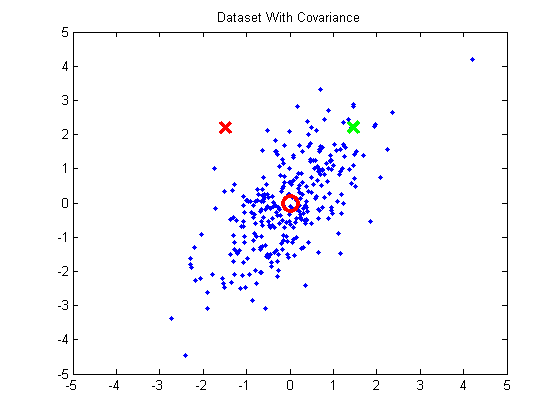
In order for the green X to have a smaller distance to the mean than the red X, we need to normalize for the covariance present in this data. The problem, though, is that the variance isn’t aligned with the x or y axes. So first we need to rotate the data so that variance is aligned with the axes (by projecting it onto the principal components):

Then we can normalize for variance, and the green X becomes much closer to the mean than the red.

From this example, we gain the following key insight:
The presence of correlation in a dataset suggests that there is off-axis variance which we need to normalize in order to make accurate distance measurements.
Variance In Image Patches
Let’s take this back to the example image patches. If we calculate the variance for each pixel in our 10,000 random 8x8 pixel patches, they all have very close to the same variance. With pixel values in the range 0 - 1, the variance ranges from 0.0514 and 0.0575. This is what we’d expect–if you pick a random pixel in an image, it should have the same variance as any other random pixel.
However, we know there is strong correlation between pixels and their neighbors. Applying our earlier insight, this tells us that there exists some variance in off-axis directions which we should ideally normalize in order to make accurate distance measurements.
We do this using PCA Whitening. First we use PCA to find the directions of variance and project the data onto those directions. Then we can easily normalize the variance.
We can look at each ‘pixel’s variance after the rotation step to confirm our intuition about there being off-axis variance. After projecting our set of 10,000 patches onto the principal components, we can measure the variance in each of the new dimensions. Here are the variances for the first 10 of the 64 dimensions:
0.3970 0.2655 0.1302 0.0961 0.0845 0.0507 0.0440 0.0408 0.0338 0.0241
After rotation, we can see that the dimensions no longer all have the same variance. The last step of PCA whitening is to normalize the variances by dividing each component by the square root of it’s variance.
Directions of Variance
So what are these “directions” in which random image patches vary? We can gain some insight into this by looking at the principal components themselves. The principal components are displayed below in row-major order; that is, the first principal component is at row 1, column 1, the second principal component is at row 1, column 2, etc.

Let’s look at just the first principal component, which is essentially a blank square. Before projecting the image patches onto these components, we calculate the mean of each pixel and subtract these means from all of the image patches, so that the image patches are all centered around 0. When you take the dot product between the (re-centered) 10k patches and this blank square, you get a set of 10k values with the following histogram:

Because we subtracted out the mean, the dot-product between the image patch and the principal component is also the correlation. A black image patch has a large positive correlation to the first component, whereas a white patch will produce a large negative value.
Here is the histogram for the second principal component (which looks like a vertical edge pattern).

An image patch containing a vertical edge that’s black on the left and white on the right will produce a strong positive correlation, or if it’s white on the left and black on the right it will produce a strong negative correlation.
We can confirm this by looking at the patches which produce the strongest positive or negative correlation to each principal component. In the following figures, the first five patches had the strongest negative correlation to the principal component, the last five had the strongest positive correlation, and the middle five had little (close to zero) correlation.
Principal component number 1:

Principal component number 2:

Principal component number 3:

Recall that the principal components are ordered by variance–e.g., the first principal component is the direction of highest variance. In this case, for the first principal component to have the highest variance means that this pattern (and it’s inverse) are the most common in the dataset. So we can interpret these principal components as a collection of the most common patterns. The most common pattern is a solid patch, followed by vertical edges, followed by horizontal edges, and so on.
This intuition is supported by PCA’s usefulness for compression. You could compress these image patches effectively by projecting them onto, say, only the first 32 principal components, and using the resulting 32-values as a compressed representation. That tells us that these patterns are effective building blocks for constructing natural image patches.
It’s also interesting to look at the histogram of correlations for the 64th principal component. Note the scale on the x-axis: ten to the negative fourteenth! There is almost no correlation in the dataset with this pattern, meaning it’s very uncommon.

The final step of PCA Whitening is to divide each component by its variance. This will have the effect of balancing out the weight of the different components. You could interpret this as saying “give comparatively less weight to a correlation (positive or negative) with the more common patterns, and comparatively more weight to a correlation with the less common patterns”.
Conclusion
Applying PCA Whitening to our image patches has the effect of normalizing them for naturally occurring variances. This normalization improves the accuracy of comparisons we make between different image patches using the Euclidean distance. The distance between the whitened patches is a much better measure of their similarity than the distance between the unwhitened patches.
Here’s a fairly cheesy example that I worked through. I created an 8x8 pixel letter D and letter B, and also created lighter versions of them. Before whitening, using the Euclidean distance, the brightened D is actually _closer _to a brightened B than it is to a dark D. The distance calculation is screwed up by the differences in brightness.
After whitening these images, however, the bright D is closer to the darker D than to the bright B.

The whitening step is performing some feature extraction which, in this example, is giving the distance comparison some invariance to changes in brightness.