GPU Benchmarks for Fine-Tuning BERT
While working on my recent Multi-Class Classification Example, I was having trouble with running out of memory on the GPU in Colab–a pretty frustrating issue!
There were actually three parameters at play which could lead to running out memory:
- My choice of training batch size (
batch_size) - My choice of sequence length (
max_len) - Which Tesla GPU Colab gave me!
This forced me to pay more attention to which GPU I was connected to, what its memory capacity was, and how long I was going to have to wait for it to finish training.
If you’re working with BERT in Colab, I think you’ll want to know these same details–so I wanted to write them up!
In Part 1, I’ll show you the specs for the different GPUs, and my benchmarks on training time.
In Part 2, I’ve created a plot illustrating the maximum sequence length at different batch sizes that will fit in memory on the Tesla K80 (the most commonly assigned GPU in Colab).
Finally, just for reference, I’ve included all of the code for generating my plots and tables in the Appendix.
This blog post is also available as a Colab Notebook here. Parts 1 and 2 are just text and figures, though, so the blog post maybe the nicer format!
by Chris McCormick
Contents
Part 1 - GPU Specs & Benchmarks
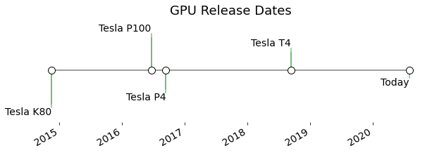
Timeline of Available GPUs
The below timeline shows the relative release dates of the different GPUs. Careful, though–we’ll see that “newer” doesn’t always mean “better”.
The letters are all tributes to prominent scientists:
- ‘K’ - Kepler
- ‘P’ - Pascal
- ‘V’ - Volta
- ‘T’ - Turing
The oldest GPU available on Colab is the Tesla K80, released in late 2014. This seems to be the most common GPU assigned to me.
Which Tesla GPUs are not in Colab’s resource pool? Only two significant ones–the Tesla V100, released in June 2017, and the Ampere A100, just released in May 2020.
The most powerful on the available lineup is actually the Tesla P100, released mid-2016. Both the P4 and (more recent) T4 are aimed at efficiency rather than raw power.
The P4 is the least desirable of the lineup for BERT work because of it’s substantially lower memory capacity.
Side Note: Tesla K80 = 2x K40
A unique detail of the Tesla K80 is that it is actually two independent GPUs on a single PCIe card.
You can see the mounting points for the two chips if you look at the backside of a K80 card.

I emphasized that the 2 chips are “independent” because (1) Colab only gives you access to one of them, and (2) even if you had access to both, it requires multi-GPU programming (i.e., Nvidia doesn’t just magically make them act like one big chip).
So if you look up specs for the Tesla K80, what you’ll find is the combined memory and performance of the two chips, which isn’t what we want!
The chip is the same one used in the Tesla K40 (with some small tweaks), so I’ll show the quoted TFLOP/s for the K40 below.
Memory Capacity
Again, memory is a precious resource when training BERT, so it’s helpful to know how much you’ll get with the different GPUs.
These numbers are the precise capacity available to you (vs. the rounded marketing numbers).

If you get a P4, I’d suggest waiting till you’re assigned something better :).
Training Speed
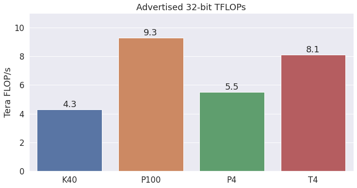
TFLOPS (The Marketing Number)
The hyped benchmark number for GPU performance is “TFLOPS”, meaning “trillions (tera) of floating point operations per second”.
It’s a decent number for comparing GPUs, but don’t use it to estimate how long a particular operation should take. The magic TFLOPS number has (at least historically) been measured by performing a single matrix multiplication that maximizes the use of the GPU’s parrallelism. Many of your GPU operations won’t be nearly as efficient.
Here are the TFLOPS for the GPUs currently found on Colab.
FYI, the new A100 is marketed as having 19.5 TFLOPS and 40GB of RAM… Awesome! (From Wikipedia)
BERT Training Time
The most useful speed measurement, of course, is how long the GPU takes to run your application.
The below training times are for a single training pass over the 20 Newsgroups dataset (taken from my Multi-Class Classification Example), with a batch size of 16 and sequence length of 128 tokens. Lower is better, of course.
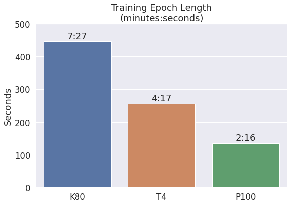
The P100 is awesome! It’s almost 3x faster than the K80, and almost 2x faster than the T4. (Note that these ratios are better than what the TFLOPS numbers would suggest!)
I don’t have numbers for the P4, unfortunately–it’s pretty rare that I’m assigned one.
Part 2 - Max Length by Batch Size
My Multi-Class Classification Example uses the 20 Newsgroups dataset, and sequence length seems to have a bigger impact on accuracy for this dataset than others I’ve played with. This motivated me to use the longest sequence length possible, but I quickly discovered that a training batch size of 16 and a sequence length of 512 doesn’t fit in a Tesla K80’s 12GB of memory!
So I had to try other values to see what would fit. Running the experiment repeatedly with different batch sizes and sequence lengths was pretty painful, though!
While struggling with that, it occurred to me that you could, for a given GPU and a given model (like ‘BERT-base’), search out the largest possible combinations of the training batch_size and max_len (the maximum input sequence length)…
So that’s exactly what I’ve done for this Notebook!
Using a Tesla K80 and BERT-base, here are the maximum sequence lengths that I found which didn’t crash the fine-tuning loop.
| batch_size | max_len |
|---|---|
| 8 | 512 |
| 12 | 512 |
| 14 | 475 |
| 16 | 430 |
| 20 | 375 |
| 24 | 325 |
| 28 | 300 |
| 32 | 280 |
| 40 | 220 |
I don’t know the exact maximum value for each batch_size–but I know these are close, because I also captured the smallest sequence length at which the GPU did run out of memory.
Here they are plotted together. The exact maximum value presumably lies somewhere between the red and green lines.

I ran a benchmark script which would create a random matrix with a particular batch size and sequence length, and then train BERT on it to see how much memory was used.
For a number of different batch_sizes, I manually tried different values of max_len to hone in on the maximum possible value that would fit in the GPU’s memory.
My benchmark script / Notebook is available here.
Appendix - Plot Code
GPU Release Timeline Plot
I followed this example to create the timeline plot: https://matplotlib.org/3.0.0/gallery/lines_bars_and_markers/timeline.html
I took the release dates from Wikipedia here: https://en.wikipedia.org/wiki/Nvidia_Tesla#Specifications
import matplotlib.pyplot as plt
import numpy as np
import matplotlib.dates as mdates
from datetime import datetime

# I've manually entered the release dates for the GPUs, taken from Wikipedia.
gpus = [('Tesla K80', datetime(year=2014, month=11, day=17)),
        ('Tesla P100', datetime(year=2016, month=6, day=20)),
        ('Tesla P4', datetime(year=2016, month=9, day=13)),
        ('Tesla T4', datetime(year=2018, month=9, day=12)),
        ('Today', datetime(year=2020, month=8, day=1))]

# Next, we'll iterate through each date and plot it on a horizontal line. We'll add some styling to the text so that overlaps aren't as strong.
# Note that Matplotlib will automatically plot datetime inputs.

# Set the size of the plot.
fig, ax = plt.subplots(figsize=(10, 3))

# Set the different possible y-values at which to put the data points.
levels = np.array([-5, 5, -3, 3, -1, 1])

# Create the horizontal line used for our timeline.

# Get the start and end dates of all the data points.
# Note that this requires that `gpus` be sorted by date.
start = gpus[0][1]
stop = gpus[-1][1]

# Plot a line between the start and end dates--use y=0 for both.
# 'k' means black line, alpha=.5 means transparency.
ax.plot((start, stop), (0, 0), 'k', alpha=.5)

# Iterate through releases, annotating each one
for ii, (iname, idate) in enumerate(gpus):

    # Choose the y-value for this date--this determines where the text will
    # be placed vertically in the plot. Note that this is just to help prevent
    # collisions between the text.
    # This will effectively iterate through the `levels` list.
    level = levels[ii % 6]

    # "Set text vertical alignment."
    # From the docs:
    #    "verticalalignment controls whether the y positional argument for the
    #     text indicates the bottom, center or top side of the text bounding
    #     box"
    vert = 'top' if level < 0 else 'bottom'

    # Plot a single dot on the timeline (i.e., at y=0) for this date.
    #   - facecolor='w', edgecolor='k'   Makes it an empty circle
    #   - zorder=9999                    TODO - What's this?
    #   - s=100                          TODO - What's this?
    ax.scatter(idate, 0, s=100, facecolor='w', edgecolor='k', zorder=9999)

    # Plot a vertical line up to the text
    ax.plot((idate, idate), (0, level), c='g', alpha=.7)

    # Give the text a faint background and align it properly
    ax.text(idate, level, iname,
            horizontalalignment='right', verticalalignment=vert, fontsize=14,
            backgroundcolor=(1., 1., 1., .3))

# Set the plot title.
ax.set(title="GPU Release Dates")
ax.title.set_fontsize(18)

# Set the range on the y-axis to leave room above and below the plot.
ax.set_ylim(-7, 7)

# Format the x-axis.

# Set the ticks on each year.
ax.get_xaxis().set_major_locator(mdates.YearLocator())

# Label the ticks to just be the year.
ax.get_xaxis().set_major_formatter(mdates.DateFormatter("%Y"))

# Increase the font size of the year labels
ax.tick_params(axis='both', which='major', labelsize=14)

# Alternate - Set the ticks on 6 month intervals.
#ax.get_xaxis().set_major_locator(mdates.MonthLocator(interval=6))

# Label the ticks with the abbreivated month and year.
#ax.get_xaxis().set_major_formatter(mdates.DateFormatter("%b %Y"))

# TODO - What's this?
fig.autofmt_xdate()

# Remove components for a cleaner look.
# Remove the y axis, and remove the x and y axes (spines).
plt.setp((ax.get_yticklabels() + ax.get_yticklines() +
          list(ax.spines.values())), visible=False)

plt.show()
GPU Specs Bargraphs
GPU Specs
- K40 —- (1/2 of a K80)
- 4.29 TFLOPS
- Memory: 12GB
- MicroWay article
- P100
- 9.3 TFLOPS
- Max Power Consumption 250 W
- Memory: 16GB
- Nvidia Datasheet
- P4
- 5.5 TFLOPS
- Max Power 75W
- Memory: 8GB
- Nvidia Datasheet
- T4
- 8.1 TFLOPS
- Max Power 70W
- Memory: 16GB
- Nvidia Website
TFLOPS Bar plot with data labels.
import matplotlib.pyplot as plt
import seaborn as sns

# Use plot styling from seaborn.
sns.set(style='darkgrid')

# Increase the plot size and font size.
sns.set(font_scale=1.5)
plt.rcParams["figure.figsize"] = (12,6)

gpu_names = ['K40',
             'P100',
             'P4',
             'T4']

tflops = [4.29,
          9.3,
          5.5,
          8.1]

# Create the barplot.
ax = sns.barplot(x=gpu_names, y=tflops, ci=None)

plt.title('Advertised 32-bit TFLOPs')
plt.ylabel('Tera FLOP/s')

# Expand the y-axis range to make room for the labels.
plt.ylim(0, 11)

# This code came from https://github.com/mwaskom/seaborn/issues/1582
for p in ax.patches:
    ax.annotate(format(p.get_height(), '.1f'), # String label
                (p.get_x() + p.get_width() / 2., p.get_height()),
                ha = 'center',
                va = 'center',
                xytext = (0, 10),
                textcoords = 'offset points')

plt.show()
Memory Capacity bar plot with data labels.
import matplotlib.pyplot as plt
import seaborn as sns

# Use plot styling from seaborn.
sns.set(style='darkgrid')

# Increase the plot size and font size.
sns.set(font_scale=1.5)
plt.rcParams["figure.figsize"] = (12,6)


gpu_names = ['K40',
             'P100',
             'P4',
             'T4']
mibs = [11441,
        16280,
        6543,
        15079]

gibs = []

# Divide each value by 2^10 to get GiB
for m in mibs:
    gibs.append(m / 2**10)

# TODO - I don't have the exact MiB measurement for the P4, just this
# GiB number.
gibs[2] = 6.39

# Create the barplot.
ax = sns.barplot(x=gpu_names, y=gibs, ci=None)

plt.title('Available Memory\n(1 GiB = 2^30 bytes)')
plt.ylabel('GiB')

# Expand the y-axis range to make room for the labels.
plt.ylim(0, 19)

# This code came from https://github.com/mwaskom/seaborn/issues/1582
for p in ax.patches:
    ax.annotate(format(p.get_height(), '.1f'), # The label string
                (p.get_x() + p.get_width() / 2., p.get_height()),
                ha = 'center',
                va = 'center',
                xytext = (0, 10),
                textcoords = 'offset points')

plt.show()
Create a plot showing the time required for a single training epoch (on my 20 Newsgroups Multi-Class example).
import matplotlib.pyplot as plt
import seaborn as sns
import time

# Use plot styling from seaborn.
sns.set(style='darkgrid')

# Increase the plot size and font size.
sns.set(font_scale=1.5)
plt.rcParams["figure.figsize"] = (9,6)

gpu_names = ['K80',
             'T4',
             'P100']

# Length of a single training epoch, in seconds.
epoch_sec = [447,
             257,
             136]

# Create the barplot
ax = sns.barplot(x=gpu_names, y=epoch_sec, ci=None)

plt.title('Training Epoch Length\n(minutes:seconds)')
plt.ylabel('Seconds')

# Expand the y-axis range to make room for the labels.
plt.ylim(0, 500)

# This code came from https://github.com/mwaskom/seaborn/issues/1582
for p in ax.patches:
    # The first argument takes the time and formats it into minutes:seconds.
    ax.annotate(time.strftime("%-M:%S", time.gmtime(p.get_height())),
                (p.get_x() + p.get_width() / 2., p.get_height()),
                ha = 'center',
                va = 'center',
                xytext = (0, 10),
                textcoords = 'offset points')

plt.show()
Maximum Parameters Plot
I ran a benchmark script which would create a random matrix with a particular batch size and sequence length, and then train BERT on it to see how much memory was used.
For a number of different batch_sizes, I manually tried different values of max_len to hone in on the maximum possible value that would fit in the GPU’s memory.
My benchmark script / Notebook is available here.
I’ve hosted my table of benchmark runs on Google Drive–this cell will download the .csv file.
Note - Currently, all datapoints were collected with the K80.
import gdown

print('Downloading datapoints...')

# Specify the name to give the file locally.
output = 'bert_gpu_memory_measurements.csv'

# Specify the Google Drive ID of the file.
file_id = '1UxP7tn-IjfDEc0CCovYAkcAYgmH6ES6l'

# Download the file.
gdown.download('https://drive.google.com/uc?id=' + file_id, output,
                quiet=False)

print('DONE.')
Read the table into a DataFrame and take a peek.
The memory numbers are provided by an Nvidia tool, and the units are “MiBs” (1 MiB = 2^20 bytes).
mem_use- The maxmimum amount of memory used during training.mem_total- The memory capacity of the GPU.
If mem_use = -1, this means that the GPU ran out of memory during the experiment.
import pandas as pd

# Load the .tsv file. Memory figures have a comma in them, so set the
# `thousands` parameter and pandas will parse the values correctly as integers.
df = pd.read_csv('bert_gpu_memory_measurements.csv', index_col=0)

df.head()
| timestamp | batch_size | max_len | gpu | mem_use | mem_total | |
|---|---|---|---|---|---|---|
| 0 | 2020-07-17 22:35:20 | 8 | 512 | Tesla K80 | 7689 | 11441 |
| 0 | 2020-07-17 23:56:40 | 12 | 450 | Tesla K80 | 9191 | 11441 |
| 1 | 2020-07-17 23:57:56 | 12 | 512 | Tesla K80 | 10729 | 11441 |
| 0 | 2020-07-18 00:02:53 | 14 | 475 | Tesla K80 | 11431 | 11441 |
| 1 | 2020-07-18 00:03:32 | 14 | 480 | Tesla K80 | -1 | 11441 |
These numbers are GPU-dependent, so filter for only the K80 results (that’s currently the only GPU that I have data for).
# Filter for just the 'Tesla K80' experiments.
df = df.loc[df.gpu.str.contains('K80')]
For each batch size that I have measurments for, I want to know the largest value of max_len for which training could fit in memory.
To do this:
- Filter out the experiments where I ran out of memory.
- Group the remaining experiments by
batch_size, and use themaxoperator to find the largest value ofmax_len. - This creates the table I want!
# Select all of the datapoints where it did fit in memory.
df_fits = df.loc[df.mem_use != -1]

# Looking at just the batch size and the maximum length...
# For each batch_size, what is the largest max_len value?
# This is the largest successful max_len.
max_possible = df_fits[['batch_size', 'max_len']].groupby(by=['batch_size']).max()

max_possible
| max_len | |
|---|---|
| batch_size | |
| 8 | 512 |
| 12 | 512 |
| 14 | 475 |
| 16 | 430 |
| 20 | 375 |
| 24 | 325 |
| 28 | 300 |
| 32 | 280 |
| 40 | 220 |
The max_len values in the above table are just the largest values that I tried–it’s possible that the GPU could handle more!
As an upperbound, I can find the smallest max_len value at which the GPU did not have enough memory.
Then we’ll know that the real maximum falls somewhere in between the two.
# Filter for experiments where it didn't fit in memory.
df_not_fits = df.loc[df.mem_use == -1]

# Looking at just the batch size and the maximum length...
# For each batch_size, what is the smallest max_len value (at which we failed).
# This is the smallest unsuccessful max_len.
too_large = df_not_fits[['batch_size', 'max_len']].groupby(by=['batch_size']).min()

too_large
| max_len | |
|---|---|
| batch_size | |
| 14 | 480 |
| 16 | 450 |
| 20 | 400 |
| 24 | 340 |
| 28 | 310 |
| 32 | 285 |
| 40 | 240 |
Now let’s plot those two tables together! This will show us the trend, and let us visualize the gap between “fit” and “didn’t fit”.
import numpy as np
import matplotlib.pyplot as plt
import seaborn as sns

# Use plot styling from seaborn.
sns.set(style='darkgrid')

# Increase the plot size and font size.
sns.set(font_scale=1.5)
plt.rcParams["figure.figsize"] = (8,4)

ax = plt.subplot(111)

# Plot the combinations that didn't work in red.
plt.plot(too_large, '-ro', )

# Plot the combinations that do work in green.
plt.plot(max_possible, '-go')

# I chose batch sizes in increments of 4, so I'll change the x-axis to
# use that tick interval.
# Alternate - Get the limits chosen by pyplot.
#min_x, max_x = ax.get_xlim()
min_x = 8
max_x = 44
stepsize = 4
ax.xaxis.set_ticks(np.arange(min_x, max_x, stepsize))

# Set the y-ticks.
min_y = 200
max_y = 512
stepsize_y = 50
ax.yaxis.set_ticks(np.arange(min_y, max_y, stepsize_y))

# Title the plot
plt.xlabel('Batch Size')
plt.ylabel('Sequence Length')
plt.title('Maximum Combinations of\nBatch Size and Sequence Length\n(Tesla K80)')
plt.legend(['Too Large', 'Fits'])

plt.show()